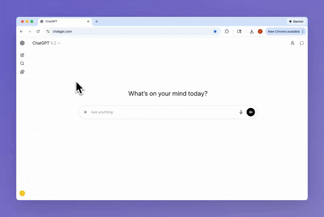
Breaking down the smaller design details which shape ChatGPT's model selection experience. Starting from the top left menu, where the user selects the model used to generate the response. There are three options - Auto, Instant, and Thinking. Instant and Thinking are models, their names refer to how long the model thinks before generating a response. Auto is the preselected option, and gives the decision between Instant and Thinking back to the model. Which means Auto is a setting, and different to the other options. But this nuance isn't exposed to the user. Instead the interface absorbs the underlying system logic into a small, understandable surface. The user isn't asked to unselect Auto, to view the two models. There are no branching decisions or fallback rules. Just three simple options which map cleanly to intent, not implementation. It's not if this, then that, it's simply here are your choices.
When the user selects the Thinking model, a blue pill appears in the composer below. With a trailing chevron to communicate there are more options available. The two options, Standard and Extended, are both variants of the Thinking model. This appears to be the solution to what was once a messy model selection experience. Options are now split across a few surfaces. At any time the set of options a user has to consider are small. With fewer options, users make faster, more confident decisions. The friction added to find the Extended variant reflects an intentional tradeoff between customer value, business cost, and performance. As this variant is more costly to run, slower to respond, and better suited for more complex requests.
The interface presents supporting text for each option differently. In the top menu, the text is always visible, appearing inside the menu item. In the composer, the text appears on hover, in a tooltip. The supporting text is unavoidable in the top menu, suggesting the choice is more important and vague without this information. The opposite is true for the composer, where it's assumed the user already has an accurate mental model when discovering this menu. I applaud the designer for not reusing the same pattern because it's easy. The two solutions show a clear understanding of the user's mental model, their task, and how much friction is required to set expectations.
Unselecting the Thinking model happens from the top menu or the composer, and it's the latter which is interesting. When hovering over the pill, the leading icon changes to a Remove icon-only button. When selected, the model selection changes back to Auto. This is a common pattern for removing a pill, but here it's applied to a component which is both a pill and a select field. So it's the leading icon which changes to a button. This small component is doing three things at once, it communicates the selected variant, allows the user to change variant, and removes the Thinking model. That's a heavy workload, but it does it effortlessly. The Remove button is less discoverable, but it isn't a problem. As the user can take the same action from the top menu, a menu they're already familiar with. Hiding this button also adds to the decluttered and spacious feel of the page.
There are some odd design decisions. Like the pill's background color changing when hovering over the Remove button. It's slightly jarring, with two adjoining background colors changing at once. I'm unsure if this is to meet contrast requirements or if it's a design system constraint.
Another decision I can't reason through is the mismatch between the pill and menu labels. When Standard is selected, the text inside the pill is Thinking. When Thinking is selected, Extended Thinking appears inside the pill. An inconsistency most users won't second guess, but it will impact usability.
ChatGPT's model selection is weird in places, but it feels right. I love the snappy animation when the composer changes layout. As well as the borderless treatment of the pill, and how the blue contrasts with the grayscale interface. The Clock icons convey very little, but they're oddly charming. Most importantly, the right information appears at the right moments. Friction is intentional and used well, actions are clearly communicated. It's easy, it's simple, and this is the part I keep coming back to. Holistically it just works and the experience is enjoyable.