In 1983, Edward Tufte shared the data-ink principle for visualizing quantitative information. He encouraged designers to increase the amount of ink displaying data, and to remove chart junk. Such as backgrounds, redundant labels, unnecessary borders, and decorative elements. Tufte believed reducing clutter leads to a more effective data visualization.
This principle applies to modern software design. But unlike static graphs and charts, humans interact with software. Removing labels, borders, and decorative elements can improve the experience, but removing too much can worsen the experience.
When Less Creates Clarity
For software designers, the data-ink principle is a reminder to use every pixel intentionally. Like Tufte removing chart junk, good software designers remove clutter. To help customers focus on the most important information.
Grouping and consolidating related information reduces clutter and improves learnability by clearly guiding customers through their tasks. When hierarchy is clear, and the next best action is the most prominent. Software is intuitive, efficient, and the customer is calm.
Consider every visual element. Imagine a list of search results displayed as cards. Do they need borders or does a divider achieve the same clarity with less visual noise? How does the border or divider thickness influence how people perceive the interface? Do the cards still appear clickable, is the list still easy to scan? Visual elements should support functionality and the customer’s tasks. Start minimal, then add only what’s necessary to help customers succeed.
When Less Becomes Too Little
Removing visual elements too aggressively strips a product of the cues telling customers how to interact with it. Like a shadow communicating depth or an animation communicating a state change. Sometimes, what might seem like chart junk is actually functional.
Great products have personality, they evoke emotion. Consider Notion and Linear, they're great products, refined and clutter-free, but also expressive. Every pixel is used intentionally, even the backgrounds, borders and decorative elements.
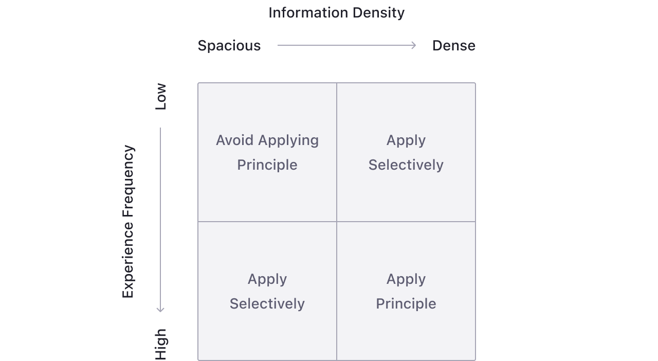
Finding the Right Balance
Imagine a 2 x2 grid - dense vs. spacious interfaces, and high vs. low frequency experiences. Dashboards, inboxes, and record pages are information dense and high-frequency. For these, removing redundant, unnecessary, and decorative visual elements improves clarity and efficiency. But for spacious, low-frequency experiences like onboarding, settings, or setup workflows, adding more brand expression creates warmth and personality.
The bookends of a workflow are also great places to add brand expression. Like the call to action inviting the customer in, and the celebratory moment when completed. These interfaces are typically spacious, low-frequency, focused on one task, and filled with emotion. They shape how people feel and remember your product, and are great places to add visual elements.
In practice, the data-ink principle isn’t about removing as much as possible. It’s about knowing what to keep, and why.